Step 4 HTML / CSS
Table of contents
We have seen a few lines of HTML and one line of JavaScript so far. In this step, we cover a few more HTML tags to complete our dashboard structure, and we introduce the third language of a web page, CSS, for the style.
Note: as you start playing with HTML and CSS, you do not necessarily need to rerun your Python code each time. Refreshing the page should be enough. However, you might experience ‘caching’ issues: the web browser pretends to refresh the page. Still, it reuses the files already downloaded without getting them again from the server. To avoid this, for example, with Firefox, you can right-click on the page then click ‘Inspect’. Finally, in the open tool, click the tab ‘Network’ and ensure that the option ‘disable cache’ on the right side is ticked.
Task 4.1 Structure the Dashboard
In this step, we only focus on the file static/index.html: code interpreted by the web browsers. A typical dashboard involves common elements such as a header and a main part with sections. All these elements fit inside the tag <body>, the visible parts.
To add a header, use the tag <header> and </header> and insert text in the middle, for example:
1
<header>COVID-19 Dashboard</header>
Note that everything could fit on one line. The placement is just for readability. Next, we could add a <main> tag to include all our charts. To create headings like in a text processor, use the tags <h1> to <h6>. In our example, we use two <h1> headings for “Around the World” and “In the Netherlands”. Finally, we have two sections with tags <section>. The first includes two <div>, one for each chart with id ‘new’ and ‘summary’. We already created the <div> for the ‘summary’ chart in the previous step. The second section includes a <div> with the id ‘netherlands’ to host the Netherlands’ chart. The HTML structure looks as follows:
1
2
3
4
5
6
7
8
9
10
11
12
13
14
15
16
17
<main>
  <h1>Around the World</h1>

  <section>
    <!-- Where to draw the newest count (Donut) -->
    <div id="new"></div>
    <!-- Where to draw the summary for all countries (Bar chart) -->
    <div id="summary"></div>
  </section>

  <h1>In the Netherlands</h1>

  <section>
    <!-- Where to draw the netherlands chart (Area chart) -->
    <div id="netherlands"></div>
  </section>
</main>
Note: the tags <!-- -->, which are the equivalent of comments in HTML.
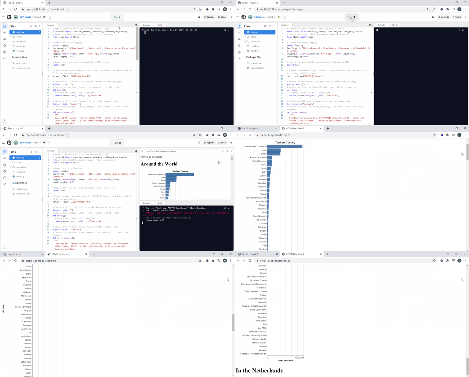
Run the code and check what the page looks like.

We obtain a page with headings of default styles. The chart shows up in the first section. The header appears at the top because we placed it first in our page’s body (not because it is called ‘header’). The tags’ names do not influence their position. We have now a structured page (behind the scenes), but not much is translating on the web page. It is where the styling of the page comes into play with CSS.
Task 4.2 Style the Dashboard
CSS stands for Cascading Style Sheets and has been created to style HTML web pages. It works as follows:
1
2
3
element {
  key: value;
}
The element points to one or many parts of the page. It is followed by curly brackets { } that include key/value pairs. Each pair define a styling property of the pointed element. Let’s start with the tag <body> as an example. We want to colour the background, give a font to all text on the page, and ensure no white margin remains all around.
1
2
3
4
5
body {
  margin: 0;
  background-color: #e6f2ff;
  font-family: Arial;
}
To add style to your page, use the tag <style> inside <head>. When we refresh the page, we obtain a light blue background, and the font changes across all page text.
The following example provides additional properties applied to <header> and <main> tags. We set a maximum width in combination with an automatic margin in the <main>. This combination centres the main area on the page when the screen exceeds 900 pixels.
1
2
3
4
5
6
7
8
9
10
11
12
13
14
header {
  height: 25px;
  background-color: #3399ff;
  color: #ffffff;
  font-weight: bold;
  font-size: 20px;
  padding: 10px;
}

main {
  padding: 30px;
  max-width: 900px;
  margin: auto;
}
We chose to structure the two sections as a grid for a dashboard. Inside each section, the elements fill up the room up to 400-pixel wide, including a 30-pixel gap between them.
1
2
3
4
5
section {
  display: grid;
  grid-gap: 30px;
  grid-template-columns: repeat(auto-fill, minmax(400px, 1fr));
}
With the greater than sign >, you can specify the style of a sub-element. For instance, we define all <div> tags into a <section> with a white background and a slight shadow giving the effect of a paper sheet.
1
2
3
4
5
section > div {
  background-color: #ffffff;
  padding: 20px;
  box-shadow: 0 4px 8px 0 rgba(0, 0, 0, 0.2);
}
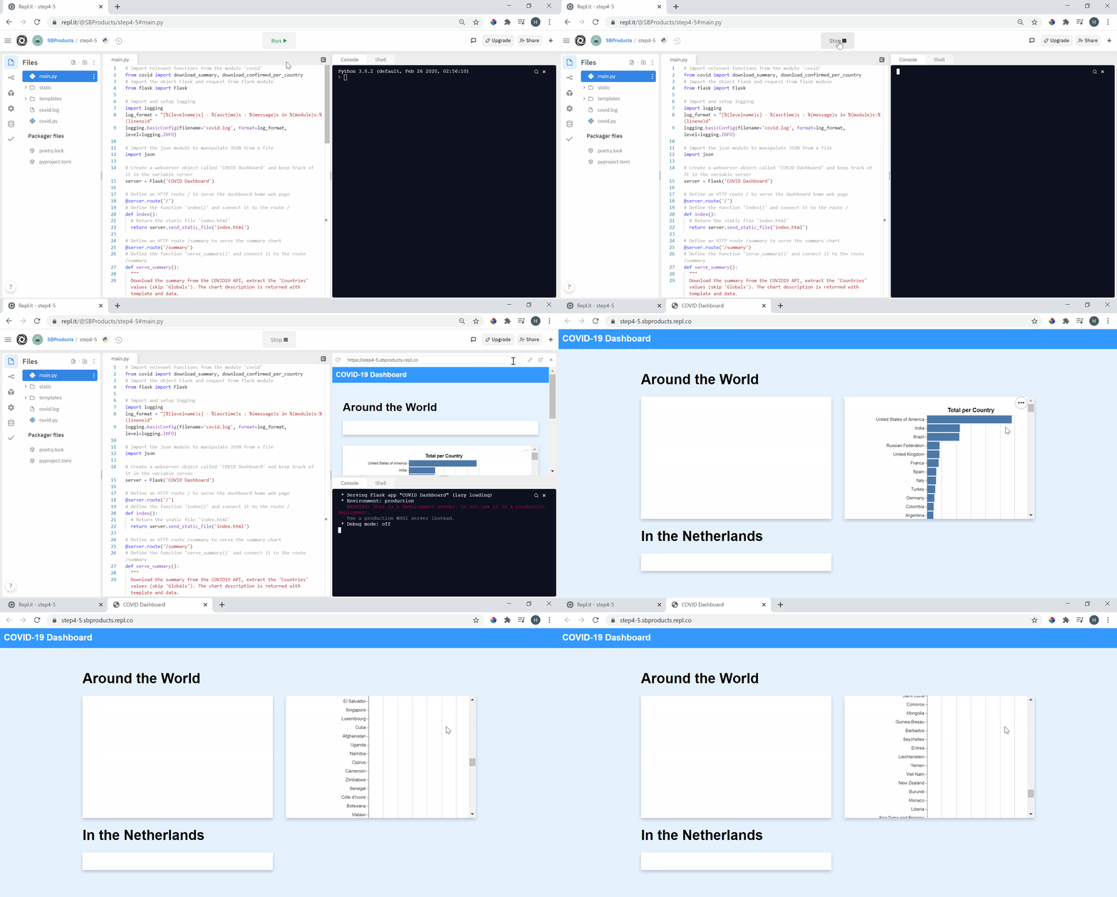
Refreshing the page should give a style to your dashboard much closer to the final result. One element that is still problematic is the length of the chart going very low on the page. We call this overflow. We could add styling to this particular element by id to solve this. Here the hashtag # means targeting the element with the id ‘summary’. We want to top its height to 280px and set the overflow as automatic to start scrolling if the content does not fit.
1
2
3
4
#summary {
  max-height: 280px;
  overflow: auto;
}
This step gave a brief introduction to HTML structure and CSS styling. Make sure to explore independently and leave your mark on this dashboard with your style.
